영신여자고등학교 리더스 아카데미 특별 강좌
 나만의 웹사이트 만들기: 2시간 만에 웹 개발자 되기!
목차
들어가며 우리가 매일 보는 웹사이트의 비밀
스토리: "웹사이트는 어떻게 만들어질까?"
여러분이 매일 접속하는 인스타그램, 네이버, 유튜브...
이 모든 웹사이트는 단 3가지 언어로 만들어집니다!
HTML = 집의 구조 (뼈대)
CSS = 인테리어와 페인트 (스타일)
JavaScript = 전기, 수도, 엘리베이터 (동작) 핵심 용어 정리
용어 | 쉬운 설명 | 예시 |
웹사이트 | 인터넷에서 볼 수 있는 디지털 공간 | 네이버, 구글, 인스타그램 |
HTML | 웹페이지의 내용과 구조를 담당하는 언어 | 제목, 문단, 이미지 배치 |
CSS | 웹페이지를 예쁘게 꾸미는 스타일 언어 | 색상, 크기, 위치 조정 |
JavaScript | 웹페이지에 움직임과 반응을 주는 프로그래밍 언어 | 버튼 클릭, 애니메이션 |
CodePen | 웹 코드를 바로 실행해볼 수 있는 온라인 놀이터 | 설치 없이 바로 코딩! |
오늘의 도구: CodePen 시작하기
1.
2.
"Start Coding" 클릭 (회원가입 없이도 가능!)
3.
3개의 창 확인:
•
HTML (왼쪽 위)
•
CSS (오른쪽 위)
•
JavaScript (왼쪽 아래)
•
Result (오른쪽 아래) - 결과 화면
Chapter 1 HTML로 집 짓기 웹의 뼈대
스토리: "HTML은 레고 블록이다!"
HTML은 레고 블록처럼 하나씩 쌓아가는 것입니다.
각 블록(태그)은 고유한 역할이 있어요.
HTML 기본 구조 이해하기
파인만 기법으로 이해하기: "태그란 무엇인가?"
태그는 꺾쇠 괄호로 된 이름표입니다.
시작 태그: <이름>
종료 태그: </이름>
내용은 그 사이에: <이름>내용</이름>
실습 1: 첫 번째 HTML 작성하기
CodePen HTML 창에 입력하세요:
<!-- 실습 1: 기본 구조 만들기 -->
<!DOCTYPE html>
<html>
<head>
<title>나의 첫 웹사이트</title>
</head>
<body>
<h1>안녕하세요! 저는 영신여고 학생입니다 👋</h1>
<p>웹 개발을 배우고 있어요!</p>
</body>
</html>
HTML
복사
코드 설명 (초보자용)
•
<!DOCTYPE html>: "이것은 HTML5 문서예요!"라고 브라우저에게 알려줌
•
<html>: 모든 내용을 감싸는 최상위 태그
•
<head>: 웹사이트의 정보를 담는 곳 (화면에 안 보임)
•
<title>: 브라우저 탭에 표시되는 제목
•
<body>: 실제로 화면에 보이는 모든 내용
•
<h1>: 가장 큰 제목 (Heading 1의 줄임말)
•
<p>: 문단 (Paragraph의 줄임말)
실습 2: 다양한 HTML 태그 활용하기
<!-- 실습 2: 자기소개 페이지 구조 -->
<body>
<!-- 제목 부분 -->
<h1>🌸 김영신의 포트폴리오</h1>
<h2>영신여자고등학교 2학년</h2>
<!-- 소개 부분 -->
<h3>💁♀️ 자기소개</h3>
<p>안녕하세요! 저는 <strong>웹 개발</strong>에 관심이 많은 학생입니다.</p>
<p>제가 좋아하는 것들:</p>
<!-- 목록 만들기 -->
<ul>
<li>📚 독서</li>
<li>🎨 그림 그리기</li>
<li>💻 코딩</li>
<li>🎵 음악 감상</li>
</ul>
<!-- 이미지 추가 -->
<img src="<https://via.placeholder.com/300x200>" alt="나의 사진">
<!-- 링크 추가 -->
<a href="<https://www.instagram.com>">내 인스타그램 구경가기</a>
<!-- 버튼 추가 -->
<button>클릭해보세요!</button>
</body>
HTML
복사
새로운 태그 설명
태그 | 역할 | 사용 예 |
<h1>~<h6> | 제목 (1이 제일 크고 6이 제일 작음) | 챕터 제목, 소제목 |
<strong> | 굵은 글씨 (중요한 내용) | 강조하고 싶은 단어 |
<ul>, <li> | 순서 없는 목록 | 취미, 특기 나열 |
<img> | 이미지 삽입 | 사진, 그림 |
<a> | 링크 연결 | 다른 페이지로 이동 |
<button> | 클릭 가능한 버튼 | 상호작용 요소 |
실습 3: 구조화된 레이아웃 만들기
<!-- 실습 3: 섹션으로 나누기 -->
<body>
<!-- 헤더 영역 -->
<header>
<h1>🌟 My Portfolio Website</h1>
<nav>
<a href="#about">소개</a>
<a href="#hobbies">취미</a>
<a href="#contact">연락처</a>
</nav>
</header>
<!-- 메인 콘텐츠 -->
<main>
<!-- 소개 섹션 -->
<section id="about">
<h2>About Me</h2>
<p>영신여고에서 꿈을 키워가는 학생입니다.</p>
</section>
<!-- 취미 섹션 -->
<section id="hobbies">
<h2>My Hobbies</h2>
<div class="hobby-card">
<h3>📖 독서</h3>
<p>매달 2권씩 책을 읽어요</p>
</div>
<div class="hobby-card">
<h3>🎮 게임</h3>
<p>친구들과 함께 즐겨요</p>
</div>
</section>
</main>
<!-- 푸터 영역 -->
<footer>
<p>© 2025 김영신. All rights reserved.</p>
</footer>
</body>
HTML
복사
레이아웃 태그 설명
•
<header>: 웹사이트 상단 영역
•
<nav>: 메뉴/네비게이션 영역
•
<main>: 주요 콘텐츠 영역
•
<section>: 관련 콘텐츠를 묶는 영역
•
<footer>: 웹사이트 하단 영역
•
<div>: 범용 컨테이너 (그룹화)
Chapter 2 CSS로 꾸미기 스타일의 마법
스토리: "CSS는 화장과 패션이다!"
HTML이 맨얼굴이라면, CSS는 메이크업과 옷입니다.
같은 사람도 스타일링에 따라 완전히 다르게 보이죠!
CSS 기본 문법
파인만 기법으로 이해하기: "CSS 규칙"
선택자 {
속성: 값;
속성: 값;
}
CSS
복사
선택자: 꾸밀 대상 지정 (누구를?)
속성: 꾸밀 요소 (무엇을?)
값: 어떻게 꾸밀지 (어떻게?)
실습 4: 첫 번째 CSS 스타일링
CodePen CSS 창에 입력하세요:
/* 실습 4: 기본 스타일링 */
/* 전체 페이지 스타일 */
body {
font-family: 'Arial', sans-serif; /* 글꼴 변경 */
background-color: #f0f8ff; /* 배경색 - 연한 하늘색 */
margin: 0; /* 여백 제거 */
padding: 20px; /* 안쪽 여백 */
}
/* 제목 스타일링 */
h1 {
color: #ff69b4; /* 글자색 - 핫핑크 */
text-align: center; /* 가운데 정렬 */
font-size: 36px; /* 글자 크기 */
text-shadow: 2px 2px 4px rgba(0,0,0,0.2); /* 그림자 효과 */
}
/* 단락 스타일링 */
p {
color: #333; /* 진한 회색 */
line-height: 1.6; /* 줄 간격 */
font-size: 16px; /* 글자 크기 */
}
/* 버튼 예쁘게 꾸미기 */
button {
background-color: #ff69b4; /* 배경색 */
color: white; /* 글자색 */
border: none; /* 테두리 제거 */
padding: 10px 20px; /* 안쪽 여백 */
border-radius: 20px; /* 둥근 모서리 */
cursor: pointer; /* 마우스 포인터 모양 */
font-size: 16px; /* 글자 크기 */
}
/* 마우스 올렸을 때 효과 */
button:hover {
background-color: #ff1493; /* 더 진한 핑크 */
transform: scale(1.05); /* 살짝 커지기 */
}
CSS
복사
실습 5: 레이아웃과 박스 디자인
/* 실습 5: 카드 디자인 만들기 */
/* 헤더 영역 디자인 */
header {
background: linear-gradient(135deg, #667eea 0%, #764ba2 100%);
color: white;
padding: 30px;
border-radius: 10px;
margin-bottom: 30px;
}
/* 네비게이션 메뉴 */
nav {
display: flex; /* 가로 배치 */
gap: 20px; /* 간격 */
justify-content: center; /* 가운데 정렬 */
margin-top: 20px;
}
nav a {
color: white;
text-decoration: none; /* 밑줄 제거 */
padding: 8px 16px;
background-color: rgba(255,255,255,0.2);
border-radius: 20px;
transition: all 0.3s; /* 부드러운 변화 */
}
nav a:hover {
background-color: rgba(255,255,255,0.4);
transform: translateY(-2px); /* 위로 살짝 올라가기 */
}
/* 취미 카드 디자인 */
.hobby-card {
background-color: white;
padding: 20px;
margin: 20px 0;
border-radius: 10px;
box-shadow: 0 4px 6px rgba(0,0,0,0.1); /* 그림자 */
transition: transform 0.3s;
}
.hobby-card:hover {
transform: translateY(-5px); /* 호버시 위로 떠오르기 */
box-shadow: 0 8px 12px rgba(0,0,0,0.15);
}
/* 섹션 스타일 */
section {
background-color: #ffffff;
padding: 30px;
margin: 20px 0;
border-radius: 15px;
border: 2px solid #f0f0f0;
}
/* 이미지 스타일링 */
img {
width: 100%;
max-width: 300px;
height: auto;
border-radius: 10px;
box-shadow: 0 4px 8px rgba(0,0,0,0.2);
}
CSS
복사
실습 6: 반응형 디자인과 애니메이션
/* 실습 6: 고급 CSS 효과 */
/* 애니메이션 정의 */
@keyframes fadeIn {
from {
opacity: 0;
transform: translateY(20px);
}
to {
opacity: 1;
transform: translateY(0);
}
}
/* 애니메이션 적용 */
h1 {
animation: fadeIn 1s ease-out;
}
/* 무지개 텍스트 효과 */
@keyframes rainbow {
0% { color: red; }
17% { color: orange; }
33% { color: yellow; }
50% { color: green; }
67% { color: blue; }
83% { color: indigo; }
100% { color: violet; }
}
.rainbow-text {
animation: rainbow 3s infinite;
font-weight: bold;
font-size: 24px;
}
/* 플렉스박스로 정렬하기 */
.container {
display: flex;
flex-wrap: wrap;
gap: 20px;
justify-content: space-around;
}
/* 반응형 디자인 - 모바일 대응 */
@media (max-width: 768px) {
body {
padding: 10px;
}
h1 {
font-size: 24px;
}
.container {
flex-direction: column;
}
}
/* 그라디언트 버튼 */
.gradient-button {
background: linear-gradient(90deg, #ff6b6b, #4ecdc4, #45b7d1);
background-size: 200% 100%;
animation: gradientShift 2s ease infinite;
color: white;
padding: 15px 30px;
border: none;
border-radius: 30px;
font-size: 18px;
font-weight: bold;
}
@keyframes gradientShift {
0% { background-position: 0% 50%; }
50% { background-position: 100% 50%; }
100% { background-position: 0% 50%; }
}
CSS
복사
CSS 주요 속성 정리
분류 | 속성 | 설명 | 예시 값 |
색상 | color | 글자색 | #ff69b4, red, rgb(255,0,0) |
background-color | 배경색 | #f0f8ff, transparent | |
background | 배경 종합 | linear-gradient(...) | |
크기 | width | 너비 | 300px, 50%, auto |
height | 높이 | 200px, 100vh | |
font-size | 글자 크기 | 16px, 1.5em, 2rem | |
여백 | margin | 바깥 여백 | 10px, auto, 0 |
padding | 안쪽 여백 | 20px 10px | |
테두리 | border | 테두리 | 2px solid #000 |
border-radius | 둥근 모서리 | 10px, 50% | |
그림자 | box-shadow | 박스 그림자 | 0 4px 6px rgba(0,0,0,0.1) |
text-shadow | 텍스트 그림자 | 2px 2px 4px #000 | |
레이아웃 | display | 표시 방식 | flex, grid, block, none |
position | 위치 지정 | relative, absolute, fixed | |
애니메이션 | transition | 변화 효과 | all 0.3s ease |
animation | 애니메이션 | fadeIn 1s ease-out |
Chapter 3 JavaScript로 생명 불어넣기
스토리: "JavaScript는 마법의 지팡이!"
HTML과 CSS로 만든 웹사이트는 그림과 같습니다.
JavaScript는 이 그림에 생명을 불어넣는 마법입니다!
JavaScript 기본 개념
파인만 기법으로 이해하기: "변수와 함수"
변수: 정보를 담는 상자함수: 일을 처리하는 기계이벤트: 사용자의 행동 (클릭, 입력 등)
실습 7: 첫 번째 JavaScript - 인터랙션 추가
CodePen JavaScript 창에 입력하세요:
// 실습 7: 버튼 클릭 이벤트
// 1. 간단한 알림 메시지
function showMessage() {
alert('안녕하세요! 버튼을 클릭했네요! 🎉');
}
// 2. 텍스트 변경하기
function changeText() {
// HTML에서 h1 태그 찾기
const title = document.querySelector('h1');
// 텍스트 변경
title.textContent = '✨ 텍스트가 변경되었어요! ✨';
// 색상도 변경
title.style.color = '#ff1493';
}
// 3. 배경색 변경하기
function changeBackground() {
// 랜덤 색상 생성
const colors = ['#ffb3ba', '#bae1ff', '#baffc9', '#ffffba', '#ffdfba'];
const randomColor = colors[Math.floor(Math.random() * colors.length)];
// 배경색 적용
document.body.style.backgroundColor = randomColor;
}
JavaScript
복사
HTML에 버튼 연결하기:
<button onclick="showMessage()">📢 메시지 보기</button>
<button onclick="changeText()">✏️ 제목 바꾸기</button>
<button onclick="changeBackground()">🎨 배경색 바꾸기</button>
HTML
복사
실습 8: 사용자 입력 받기
// 실습 8: 이름 입력받아 인사하기
function greetUser() {
// 사용자에게 이름 묻기
const userName = prompt('이름이 뭐예요?');
// 이름이 입력되었는지 확인
if (userName) {
// 인사 메시지 만들기
const greeting = `안녕하세요, ${userName}님! 반가워요! 🌟`;
// HTML에 표시하기
document.getElementById('greeting').innerHTML = greeting;
}
}
// 나이 계산기
function calculateAge() {
// 태어난 년도 입력받기
const birthYear = prompt('태어난 년도를 입력하세요 (예: 2008)');
// 현재 년도
const currentYear = 2025;
// 나이 계산
const age = currentYear - birthYear;
// 결과 표시
alert(`당신은 ${age}살이네요! 🎂`);
}
JavaScript
복사
HTML 추가:
<div class="user-interaction">
<h2>👋 방문자와 소통하기</h2>
<!-- 인사하기 섹션 -->
<div class="greeting-section">
<button onclick="greetUser()">🙋 이름 입력하고 인사받기</button>
<p id="greeting" style="font-size: 20px; color: #ff69b4; margin-top: 20px;"></p>
</div>
<!-- 나이 계산기 섹션 -->
<div class="age-section">
<button onclick="calculateAge()">🎂 나이 계산하기</button>
</div>
<!-- 추가 인터랙션 -->
<div class="favorite-section">
<h3>좋아하는 것 선택하기</h3>
<button onclick="chooseFavorite()">💝 좋아하는 색 선택</button>
<div id="favoriteResult"></div>
</div>
</div>
<script>
// 추가 함수: 좋아하는 색 선택
function chooseFavorite() {
const colors = ['빨강 ❤️', '파랑 💙', '초록 💚', '노랑 💛', '보라 💜'];
let colorList = '좋아하는 색을 선택하세요:\\n';
colors.forEach((color, index) => {
colorList += `${index + 1}. ${color}\\n`;
});
const choice = prompt(colorList + '\\n번호를 입력하세요 (1-5):');
if (choice >= 1 && choice <= 5) {
const selectedColor = colors[choice - 1];
document.getElementById('favoriteResult').innerHTML =
`<p style="font-size: 18px;">당신이 선택한 색: <strong>${selectedColor}</strong></p>`;
}
}
</script>
HTML
복사
실습 9: 실시간 시계 만들기
// 실습 9: 디지털 시계
function updateClock() {
// 현재 시간 가져오기
const now = new Date();
const hours = now.getHours();
const minutes = now.getMinutes();
const seconds = now.getSeconds();
// 두 자리수로 만들기 (예: 9 → 09)
const formatTime = (num) => num < 10 ? '0' + num : num;
// 시간 문자열 만들기
const timeString = `${formatTime(hours)}:${formatTime(minutes)}:${formatTime(seconds)}`;
// HTML에 표시
document.getElementById('clock').innerHTML = timeString;
}
// 1초마다 시계 업데이트
setInterval(updateClock, 1000);
// 페이지 로드시 바로 실행
updateClock();
JavaScript
복사
HTML 추가:
<div id="clock" style="font-size: 48px; text-align: center; color: #ff69b4;">
00:00:00
</div>
HTML
복사
실습 10: 투두리스트 만들기
// 실습 10: 간단한 할 일 목록
// 할 일 추가 함수
function addTodo() {
// 입력 필드 가져오기
const input = document.getElementById('todoInput');
const todoText = input.value;
// 빈 값 체크
if (todoText === '') {
alert('할 일을 입력해주세요! 📝');
return;
}
// 리스트 아이템 만들기
const li = document.createElement('li');
li.innerHTML = `
<span>${todoText}</span>
<button onclick="removeTodo(this)">❌</button>
`;
// 리스트에 추가
document.getElementById('todoList').appendChild(li);
// 입력 필드 비우기
input.value = '';
}
// 할 일 삭제 함수
function removeTodo(button) {
// 버튼의 부모 요소(li) 삭제
button.parentElement.remove();
}
// 엔터키로 추가하기
function checkEnter(event) {
if (event.key === 'Enter') {
addTodo();
}
}
JavaScript
복사
HTML 추가:
<div class="todo-container">
<h2>📝 나의 할 일 목록</h2>
<input type="text" id="todoInput" placeholder="할 일을 입력하세요" onkeypress="checkEnter(event)">
<button onclick="addTodo()">추가</button>
<ul id="todoList"></ul>
</div>
HTML
복사
실습 11: 이미지 갤러리
// 실습 11: 이미지 슬라이드쇼
const images = [
'<https://picsum.photos/400/300?random=1>',
'<https://picsum.photos/400/300?random=2>',
'<https://picsum.photos/400/300?random=3>',
'<https://picsum.photos/400/300?random=4>'
];
let currentIndex = 0;
function showImage(index) {
const imgElement = document.getElementById('galleryImage');
imgElement.src = images[index];
}
function nextImage() {
currentIndex = (currentIndex + 1) % images.length;
showImage(currentIndex);
}
function prevImage() {
currentIndex = (currentIndex - 1 + images.length) % images.length;
showImage(currentIndex);
}
// 자동 슬라이드
setInterval(nextImage, 3000);
JavaScript
복사
HTML 추가:
<div class="gallery-container">
<h2>🖼️ 이미지 갤러리</h2>
<div class="gallery">
<!-- 이미지 표시 영역 -->
<img id="galleryImage" src="<https://picsum.photos/400/300?random=1>" alt="갤러리 이미지">
<!-- 컨트롤 버튼 -->
<div class="gallery-controls">
<button onclick="prevImage()">⬅️ 이전</button>
<button onclick="nextImage()">다음 ➡️</button>
</div>
<!-- 이미지 인디케이터 -->
<div class="image-indicators">
<span class="indicator active" onclick="showImage(0)">●</span>
<span class="indicator" onclick="showImage(1)">●</span>
<span class="indicator" onclick="showImage(2)">●</span>
<span class="indicator" onclick="showImage(3)">●</span>
</div>
</div>
</div>
<style>
.gallery-container {
text-align: center;
padding: 20px;
}
.gallery {
position: relative;
max-width: 400px;
margin: 0 auto;
}
.gallery img {
width: 100%;
height: 300px;
object-fit: cover;
border-radius: 10px;
box-shadow: 0 4px 6px rgba(0,0,0,0.1);
}
.gallery-controls {
margin-top: 20px;
}
.gallery-controls button {
padding: 10px 20px;
margin: 0 10px;
background-color: #ff69b4;
color: white;
border: none;
border-radius: 20px;
cursor: pointer;
}
.gallery-controls button:hover {
background-color: #ff1493;
}
.image-indicators {
margin-top: 15px;
}
.indicator {
cursor: pointer;
color: #ccc;
margin: 0 5px;
font-size: 20px;
transition: color 0.3s;
}
.indicator.active {
color: #ff69b4;
}
</style>
<script>
// 인디케이터 업데이트 함수 추가
function updateIndicators() {
const indicators = document.querySelectorAll('.indicator');
indicators.forEach((indicator, index) => {
if (index === currentIndex) {
indicator.classList.add('active');
} else {
indicator.classList.remove('active');
}
});
}
// showImage 함수 수정
function showImage(index) {
currentIndex = index;
const imgElement = document.getElementById('galleryImage');
imgElement.src = images[index];
updateIndicators();
}
// nextImage 함수 수정
function nextImage() {
currentIndex = (currentIndex + 1) % images.length;
showImage(currentIndex);
}
// prevImage 함수 수정
function prevImage() {
currentIndex = (currentIndex - 1 + images.length) % images.length;
showImage(currentIndex);
}
</script>
HTML
복사
JavaScript 핵심 개념 정리
개념 | 설명 | 예시 |
변수 (Variable) | 데이터를 저장하는 공간 | let name = "영신"; |
함수 (Function) | 재사용 가능한 코드 블록 | function sayHello() {...} |
이벤트 (Event) | 사용자의 행동 감지 | onclick, onmouseover |
DOM | HTML 요소를 제어하는 방법 | document.querySelector() |
조건문 (If) | 조건에 따른 실행 | if (age > 18) {...} |
반복문 (Loop) | 반복 실행 | for (let i=0; i<10; i++) |
배열 (Array) | 여러 데이터 저장 | [1, 2, 3, 4, 5] |
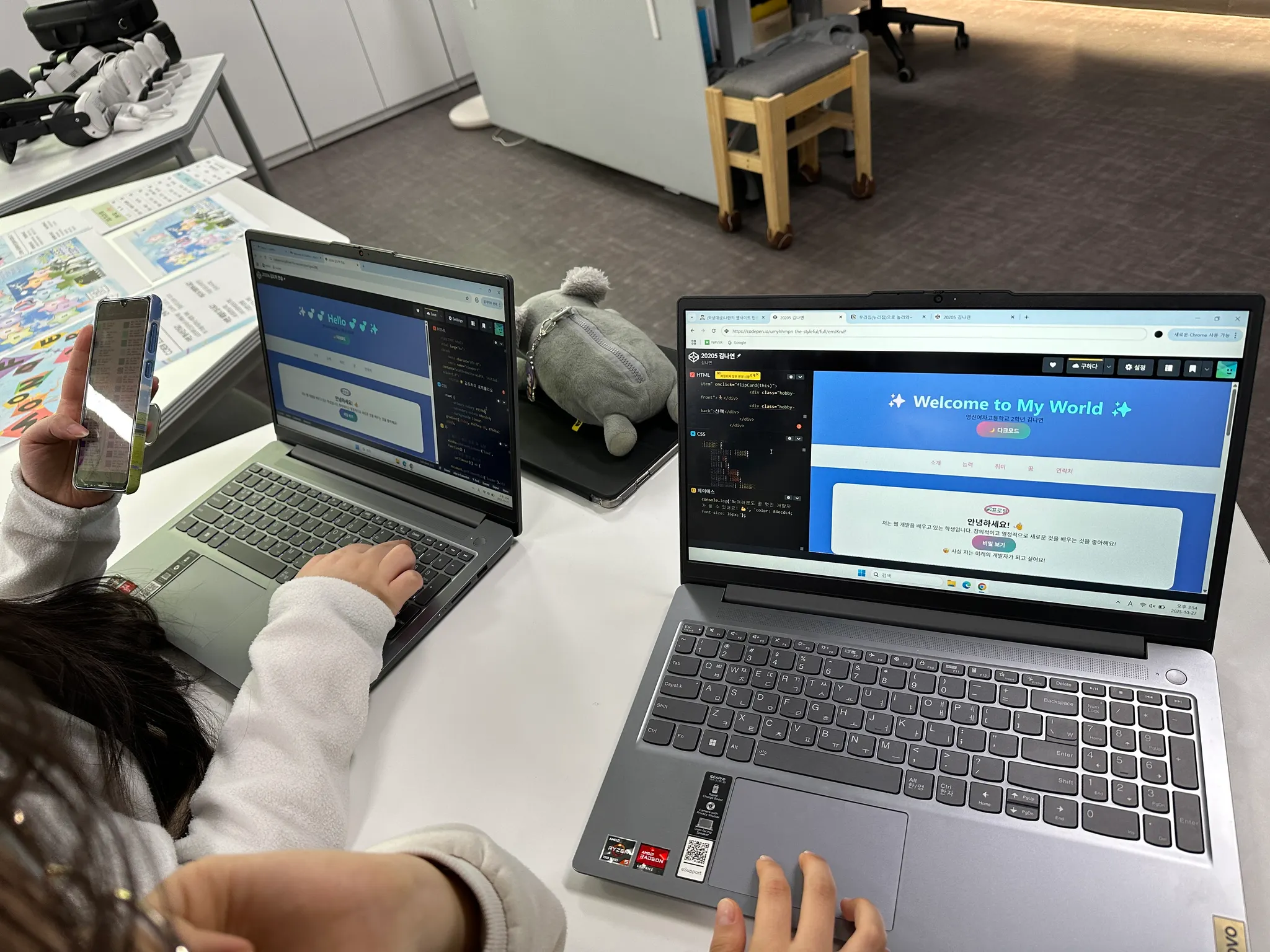
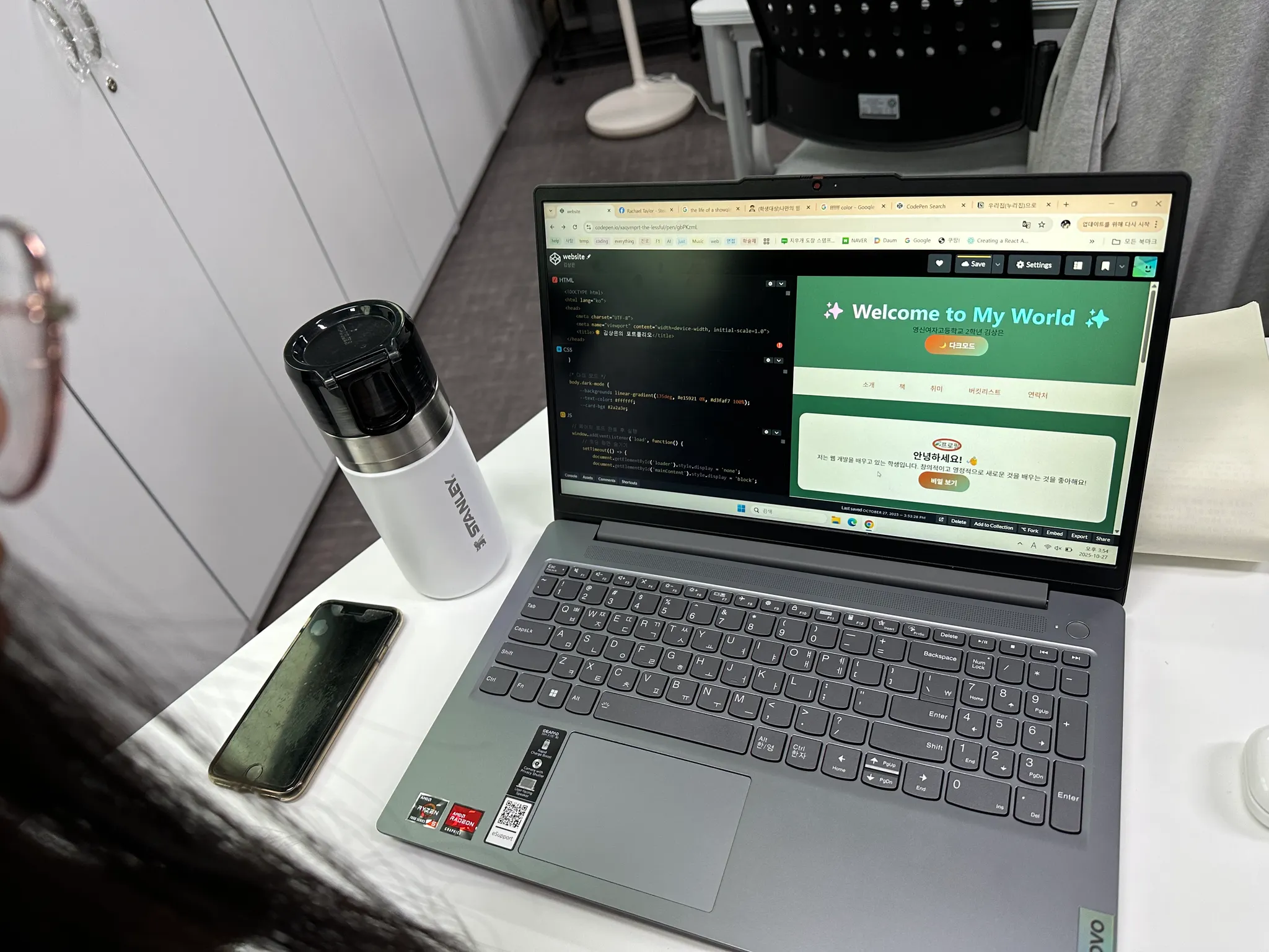
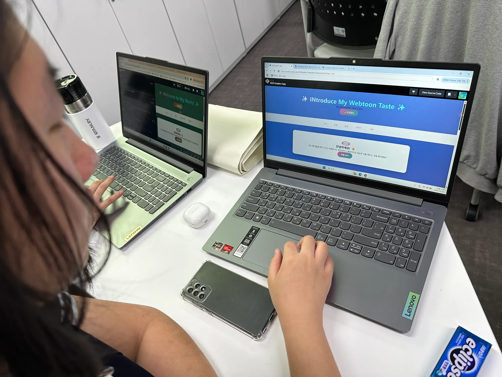
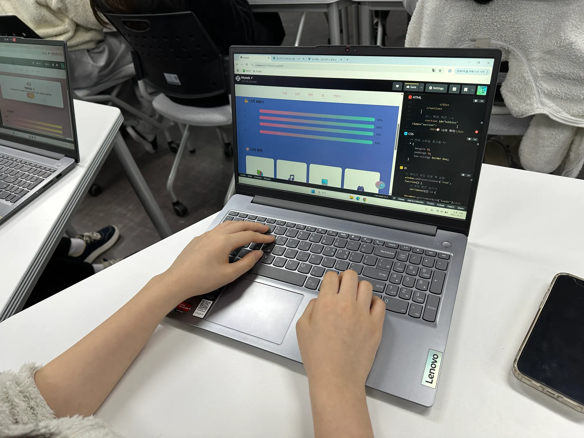
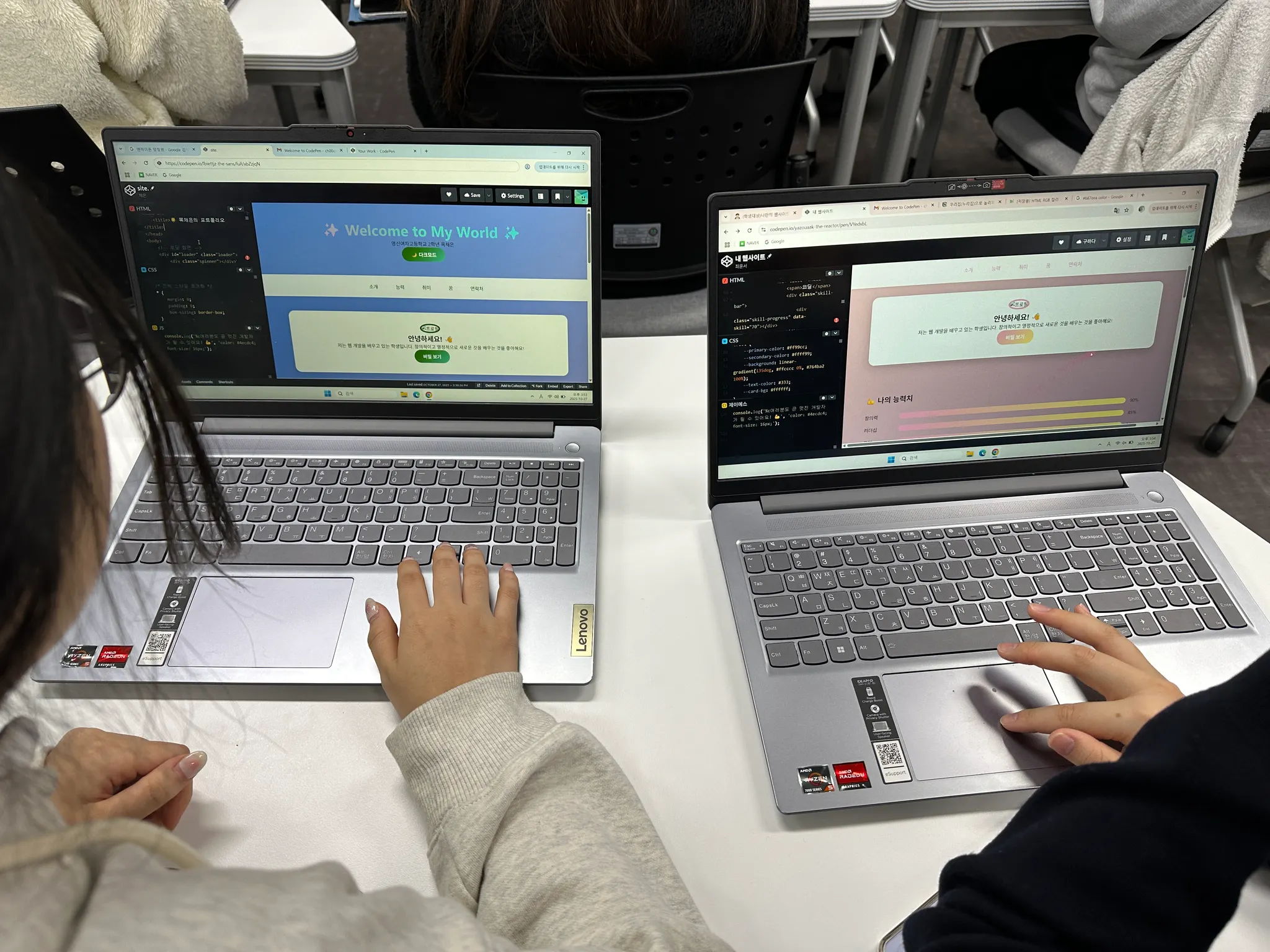
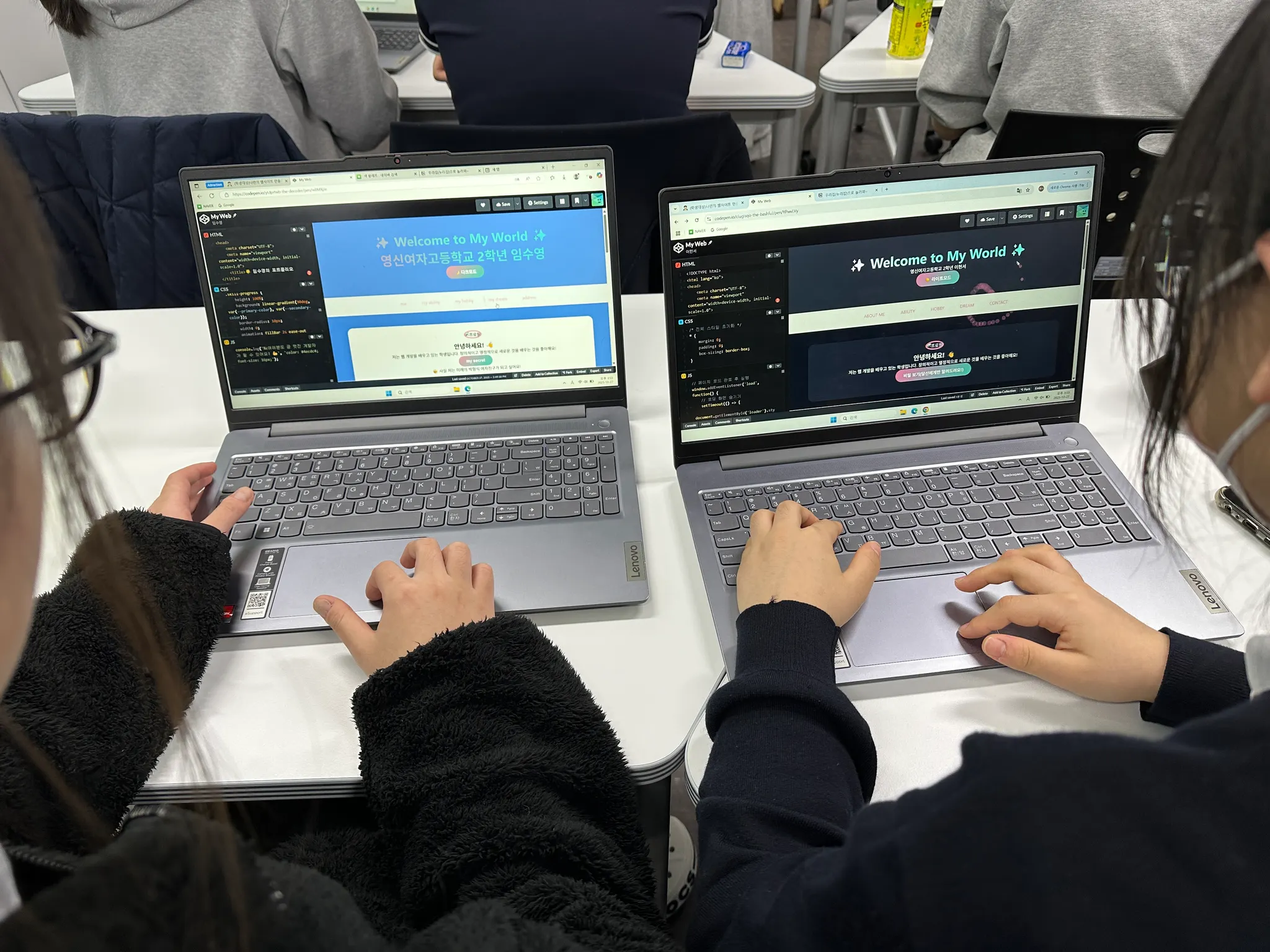
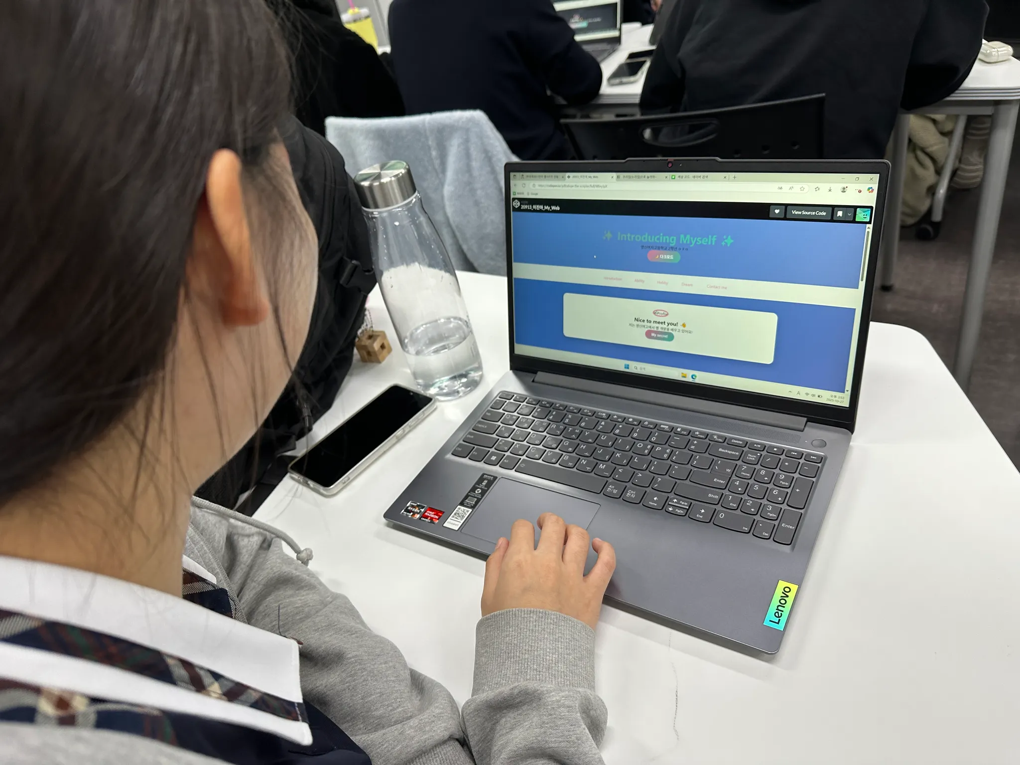
Final Project 나만의 자기소개 웹사이트
프로젝트 목표
2시간 동안 배운 HTML, CSS, JavaScript를 모두 활용하여
나만의 특별한 자기소개 웹사이트를 만들어봅시다!
요구사항 체크리스트
HTML: 최소 5개 이상의 다른 태그 사용
CSS: 색상, 레이아웃, 애니메이션 포함
JavaScript: 최소 2개 이상의 인터랙션
창의성: 자신만의 독특한 아이디어 추가
최종 프로젝트 코드
HTML (전체 구조):
<!DOCTYPE html>
<html lang="ko">
<head>
<meta charset="UTF-8">
<meta name="viewport" content="width=device-width, initial-scale=1.0">
<title>🌟 김영신의 포트폴리오</title>
</head>
<body>
<!-- 로딩 화면 -->
<div id="loader" class="loader">
<div class="spinner"></div>
<p>Loading...</p>
</div>
<!-- 메인 컨테이너 -->
<div id="mainContent" style="display: none;">
<!-- 헤더 -->
<header class="animated-header">
<h1 class="glowing-text">✨ Welcome to My World ✨</h1>
<p class="subtitle">영신여자고등학교 2학년 김영신</p>
<button onclick="toggleTheme()" class="theme-button">🌙 다크모드</button>
</header>
<!-- 네비게이션 -->
<nav class="sticky-nav">
<a href="#about" class="nav-link">소개</a>
<a href="#skills" class="nav-link">능력</a>
<a href="#hobbies" class="nav-link">취미</a>
<a href="#dreams" class="nav-link">꿈</a>
<a href="#contact" class="nav-link">연락처</a>
</nav>
<!-- 소개 섹션 -->
<section id="about" class="section">
<div class="profile-card">
<img src="<https://via.placeholder.com/150>" alt="프로필" class="profile-img">
<h2>안녕하세요! 👋</h2>
<p class="typing-text" id="typingText"></p>
<button onclick="showSecret()" class="secret-button">비밀 보기</button>
<div id="secret" class="secret-message" style="display: none;">
<p>🤫 사실 저는 미래의 개발자가 되고 싶어요!</p>
</div>
</div>
</section>
<!-- 스킬 섹션 -->
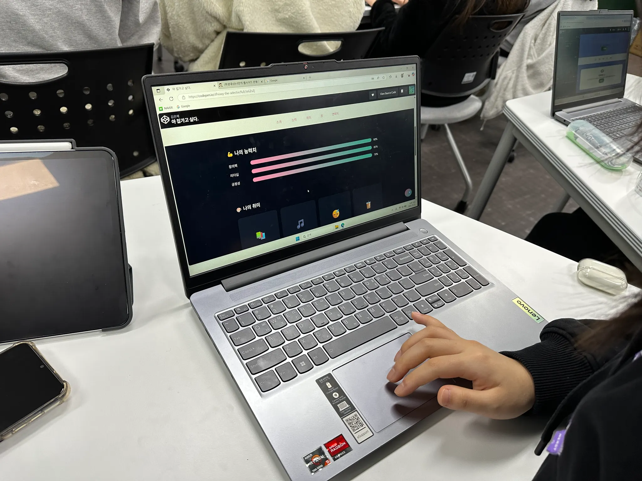
<section id="skills" class="section">
<h2>💪 나의 능력치</h2>
<div class="skill-container">
<div class="skill">
<span>창의력</span>
<div class="skill-bar">
<div class="skill-progress" data-skill="90"></div>
</div>
<span class="skill-percent">90%</span>
</div>
<div class="skill">
<span>리더십</span>
<div class="skill-bar">
<div class="skill-progress" data-skill="85"></div>
</div>
<span class="skill-percent">85%</span>
</div>
<div class="skill">
<span>코딩</span>
<div class="skill-bar">
<div class="skill-progress" data-skill="70"></div>
</div>
<span class="skill-percent">70%</span>
</div>
</div>
</section>
<!-- 취미 섹션 -->
<section id="hobbies" class="section">
<h2>🎨 나의 취미</h2>
<div class="hobby-gallery">
<div class="hobby-item" onclick="flipCard(this)">
<div class="hobby-front">📚</div>
<div class="hobby-back">독서</div>
</div>
<div class="hobby-item" onclick="flipCard(this)">
<div class="hobby-front">🎵</div>
<div class="hobby-back">음악</div>
</div>
<div class="hobby-item" onclick="flipCard(this)">
<div class="hobby-front">💻</div>
<div class="hobby-back">코딩</div>
</div>
<div class="hobby-item" onclick="flipCard(this)">
<div class="hobby-front">🎮</div>
<div class="hobby-back">게임</div>
</div>
</div>
</section>
<!-- 꿈 섹션 -->
<section id="dreams" class="section">
<h2>🌈 나의 꿈</h2>
<div class="dream-cloud">
<p>"세상을 바꾸는 개발자가 되고 싶어요"</p>
<button onclick="showDreamDetails()" class="dream-button">자세히 보기</button>
</div>
<div id="dreamDetails" class="dream-details" style="display: none;">
<ul>
<li>✅ 유용한 앱 만들기</li>
<li>✅ 사람들을 도와주는 서비스 개발</li>
<li>✅ 기술로 세상을 더 나은 곳으로</li>
</ul>
</div>
</section>
<!-- 연락처 섹션 -->
<section id="contact" class="section">
<h2>📬 연락하기</h2>
<div class="contact-form">
<input type="text" id="visitorName" placeholder="이름을 입력하세요">
<textarea id="message" placeholder="메시지를 남겨주세요"></textarea>
<button onclick="sendMessage()">메시지 보내기</button>
</div>
<div id="messageList" class="message-list"></div>
</section>
<!-- 푸터 -->
<footer>
<p>Made with ❤️ by 김영신 | 2025</p>
<p>현재 시간: <span id="currentTime"></span></p>
</footer>
</div>
<!-- 플로팅 버튼 -->
<button onclick="scrollToTop()" id="topButton" class="top-button">⬆️</button>
</body>
</html>
HTML
복사
CSS (전체 스타일):
/* 전체 스타일 초기화 */
* {
margin: 0;
padding: 0;
box-sizing: border-box;
}
/* 변수 정의 - 색상 테마 */
:root {
--primary-color: #ff69b4;
--secondary-color: #4ecdc4;
--background: linear-gradient(135deg, #667eea 0%, #764ba2 100%);
--text-color: #333;
--card-bg: #ffffff;
}
/* 다크 모드 */
body.dark-mode {
--background: linear-gradient(135deg, #1a1a2e 0%, #0f0f1e 100%);
--text-color: #ffffff;
--card-bg: #2a2a3e;
}
/* 바디 스타일 */
body {
font-family: 'Segoe UI', Tahoma, Geneva, Verdana, sans-serif;
background: var(--background);
color: var(--text-color);
min-height: 100vh;
transition: all 0.5s ease;
}
/* 로딩 화면 */
.loader {
position: fixed;
top: 0;
left: 0;
width: 100%;
height: 100%;
background: linear-gradient(135deg, #667eea 0%, #764ba2 100%);
display: flex;
flex-direction: column;
justify-content: center;
align-items: center;
z-index: 9999;
}
.spinner {
width: 50px;
height: 50px;
border: 5px solid #fff;
border-top-color: transparent;
border-radius: 50%;
animation: spin 1s linear infinite;
}
@keyframes spin {
to { transform: rotate(360deg); }
}
/* 헤더 애니메이션 */
.animated-header {
text-align: center;
padding: 50px 20px;
background: rgba(255, 255, 255, 0.1);
backdrop-filter: blur(10px);
animation: slideDown 1s ease-out;
}
@keyframes slideDown {
from {
transform: translateY(-100px);
opacity: 0;
}
to {
transform: translateY(0);
opacity: 1;
}
}
/* 빛나는 텍스트 */
.glowing-text {
font-size: 48px;
background: linear-gradient(45deg, #ff69b4, #4ecdc4, #45b7d1);
-webkit-background-clip: text;
-webkit-text-fill-color: transparent;
animation: glow 2s ease-in-out infinite;
}
@keyframes glow {
0%, 100% { filter: brightness(1); }
50% { filter: brightness(1.5); }
}
/* 스티키 네비게이션 */
.sticky-nav {
position: sticky;
top: 0;
background: rgba(255, 255, 255, 0.95);
backdrop-filter: blur(10px);
padding: 15px;
display: flex;
justify-content: center;
gap: 20px;
z-index: 100;
box-shadow: 0 2px 10px rgba(0, 0, 0, 0.1);
}
.nav-link {
text-decoration: none;
color: var(--primary-color);
padding: 10px 20px;
border-radius: 25px;
transition: all 0.3s;
position: relative;
overflow: hidden;
}
.nav-link:before {
content: '';
position: absolute;
top: 0;
left: -100%;
width: 100%;
height: 100%;
background: var(--primary-color);
transition: left 0.3s;
z-index: -1;
}
.nav-link:hover {
color: white;
}
.nav-link:hover:before {
left: 0;
}
/* 섹션 스타일 */
.section {
padding: 50px 20px;
max-width: 1000px;
margin: 0 auto;
animation: fadeIn 1s ease-out;
}
@keyframes fadeIn {
from {
opacity: 0;
transform: translateY(30px);
}
to {
opacity: 1;
transform: translateY(0);
}
}
/* 프로필 카드 */
.profile-card {
background: var(--card-bg);
padding: 40px;
border-radius: 20px;
text-align: center;
box-shadow: 0 10px 30px rgba(0, 0, 0, 0.2);
transform-style: preserve-3d;
transition: transform 0.6s;
}
.profile-card:hover {
transform: rotateY(5deg) rotateX(5deg);
}
.profile-img {
width: 150px;
height: 150px;
border-radius: 50%;
border: 5px solid var(--primary-color);
animation: float 3s ease-in-out infinite;
}
@keyframes float {
0%, 100% { transform: translateY(0); }
50% { transform: translateY(-10px); }
}
/* 스킬 바 */
.skill-container {
display: grid;
gap: 20px;
margin-top: 30px;
}
.skill {
display: grid;
grid-template-columns: 100px 1fr 50px;
align-items: center;
gap: 15px;
}
.skill-bar {
background: rgba(255, 255, 255, 0.2);
height: 20px;
border-radius: 10px;
overflow: hidden;
}
.skill-progress {
height: 100%;
background: linear-gradient(90deg, var(--primary-color), var(--secondary-color));
border-radius: 10px;
width: 0;
animation: fillBar 2s ease-out forwards;
}
@keyframes fillBar {
to {
width: attr(data-skill);
}
}
/* 취미 갤러리 */
.hobby-gallery {
display: grid;
grid-template-columns: repeat(auto-fit, minmax(150px, 1fr));
gap: 20px;
margin-top: 30px;
}
.hobby-item {
aspect-ratio: 1;
background: var(--card-bg);
border-radius: 15px;
display: flex;
align-items: center;
justify-content: center;
cursor: pointer;
position: relative;
transform-style: preserve-3d;
transition: transform 0.6s;
box-shadow: 0 5px 15px rgba(0, 0, 0, 0.2);
}
.hobby-item.flipped {
transform: rotateY(180deg);
}
.hobby-front, .hobby-back {
position: absolute;
width: 100%;
height: 100%;
display: flex;
align-items: center;
justify-content: center;
backface-visibility: hidden;
border-radius: 15px;
}
.hobby-front {
font-size: 48px;
}
.hobby-back {
background: linear-gradient(135deg, var(--primary-color), var(--secondary-color));
color: white;
font-size: 20px;
font-weight: bold;
transform: rotateY(180deg);
}
/* 꿈 구름 */
.dream-cloud {
background: white;
padding: 40px;
border-radius: 50px;
position: relative;
text-align: center;
box-shadow: 0 10px 30px rgba(0, 0, 0, 0.1);
animation: float 4s ease-in-out infinite;
}
.dream-cloud:before,
.dream-cloud:after {
content: '';
position: absolute;
background: white;
border-radius: 50%;
}
.dream-cloud:before {
width: 50px;
height: 50px;
bottom: -25px;
left: 20%;
}
.dream-cloud:after {
width: 30px;
height: 30px;
bottom: -35px;
left: 15%;
}
/* 버튼 스타일 */
button {
background: linear-gradient(135deg, var(--primary-color), var(--secondary-color));
color: white;
border: none;
padding: 12px 30px;
border-radius: 25px;
font-size: 16px;
font-weight: bold;
cursor: pointer;
transition: all 0.3s;
position: relative;
overflow: hidden;
}
button:before {
content: '';
position: absolute;
top: 50%;
left: 50%;
width: 0;
height: 0;
background: rgba(255, 255, 255, 0.5);
border-radius: 50%;
transform: translate(-50%, -50%);
transition: width 0.6s, height 0.6s;
}
button:hover {
transform: translateY(-2px);
box-shadow: 0 5px 15px rgba(0, 0, 0, 0.3);
}
button:active:before {
width: 300px;
height: 300px;
}
/* 연락 폼 */
.contact-form {
display: flex;
flex-direction: column;
gap: 15px;
max-width: 500px;
margin: 0 auto;
}
.contact-form input,
.contact-form textarea {
padding: 15px;
border: 2px solid var(--primary-color);
border-radius: 10px;
font-size: 16px;
transition: all 0.3s;
}
.contact-form input:focus,
.contact-form textarea:focus {
outline: none;
border-color: var(--secondary-color);
transform: scale(1.02);
}
/* 메시지 리스트 */
.message-list {
margin-top: 30px;
max-height: 300px;
overflow-y: auto;
}
.message-item {
background: var(--card-bg);
padding: 15px;
border-radius: 10px;
margin-bottom: 10px;
animation: slideIn 0.5s ease-out;
}
@keyframes slideIn {
from {
transform: translateX(-100%);
opacity: 0;
}
to {
transform: translateX(0);
opacity: 1;
}
}
/* Top 버튼 */
.top-button {
position: fixed;
bottom: 30px;
right: 30px;
width: 50px;
height: 50px;
border-radius: 50%;
display: none;
z-index: 1000;
animation: bounce 2s infinite;
}
@keyframes bounce {
0%, 20%, 50%, 80%, 100% { transform: translateY(0); }
40% { transform: translateY(-10px); }
60% { transform: translateY(-5px); }
}
/* 푸터 */
footer {
text-align: center;
padding: 30px;
background: rgba(0, 0, 0, 0.1);
margin-top: 50px;
}
/* 반응형 디자인 */
@media (max-width: 768px) {
.glowing-text {
font-size: 32px;
}
.hobby-gallery {
grid-template-columns: repeat(2, 1fr);
}
.skill {
grid-template-columns: 1fr;
text-align: center;
}
}
CSS
복사
JavaScript (전체 기능):
// 페이지 로드 완료 후 실행
window.addEventListener('load', function() {
// 로딩 화면 숨기기
setTimeout(() => {
document.getElementById('loader').style.display = 'none';
document.getElementById('mainContent').style.display = 'block';
// 스킬 바 애니메이션
animateSkills();
// 타이핑 효과
typeWriter();
// 시계 시작
updateTime();
setInterval(updateTime, 1000);
}, 2000);
});
// 다크모드 토글
function toggleTheme() {
document.body.classList.toggle('dark-mode');
const button = document.querySelector('.theme-button');
if (document.body.classList.contains('dark-mode')) {
button.textContent = '☀️ 라이트모드';
} else {
button.textContent = '🌙 다크모드';
}
}
// 타이핑 효과
function typeWriter() {
const text = "저는 웹 개발을 배우고 있는 학생입니다. 창의적이고 열정적으로 새로운 것을 배우는 것을 좋아해요!";
const element = document.getElementById('typingText');
let index = 0;
function type() {
if (index < text.length) {
element.innerHTML += text.charAt(index);
index++;
setTimeout(type, 50);
}
}
type();
}
// 비밀 메시지 표시
function showSecret() {
const secret = document.getElementById('secret');
if (secret.style.display === 'none') {
secret.style.display = 'block';
secret.style.animation = 'fadeIn 0.5s';
} else {
secret.style.display = 'none';
}
}
// 스킬 바 애니메이션
function animateSkills() {
const skills = document.querySelectorAll('.skill-progress');
skills.forEach(skill => {
const value = skill.getAttribute('data-skill');
skill.style.width = value + '%';
});
}
// 취미 카드 뒤집기
function flipCard(card) {
card.classList.toggle('flipped');
}
// 꿈 상세 정보 표시
function showDreamDetails() {
const details = document.getElementById('dreamDetails');
if (details.style.display === 'none') {
details.style.display = 'block';
details.style.animation = 'slideDown 0.5s';
} else {
details.style.display = 'none';
}
}
// 메시지 보내기
function sendMessage() {
const name = document.getElementById('visitorName').value;
const message = document.getElementById('message').value;
if (name === '' || message === '') {
alert('이름과 메시지를 모두 입력해주세요! 📝');
return;
}
const messageList = document.getElementById('messageList');
const messageItem = document.createElement('div');
messageItem.className = 'message-item';
messageItem.innerHTML = `
<strong>${name}</strong>
<p>${message}</p>
<small>${new Date().toLocaleString()}</small>
`;
messageList.insertBefore(messageItem, messageList.firstChild);
// 입력 필드 초기화
document.getElementById('visitorName').value = '';
document.getElementById('message').value = '';
alert('메시지가 전송되었습니다! 감사합니다! 💌');
}
// 현재 시간 업데이트
function updateTime() {
const now = new Date();
const timeString = now.toLocaleTimeString('ko-KR');
document.getElementById('currentTime').textContent = timeString;
}
// 맨 위로 스크롤
function scrollToTop() {
window.scrollTo({
top: 0,
behavior: 'smooth'
});
}
// 스크롤 이벤트 리스너
window.addEventListener('scroll', function() {
const topButton = document.getElementById('topButton');
if (window.pageYOffset > 300) {
topButton.style.display = 'block';
} else {
topButton.style.display = 'none';
}
});
// 부드러운 스크롤
document.querySelectorAll('a[href^="#"]').forEach(anchor => {
anchor.addEventListener('click', function (e) {
e.preventDefault();
const target = document.querySelector(this.getAttribute('href'));
if (target) {
target.scrollIntoView({
behavior: 'smooth',
block: 'start'
});
}
});
});
// 마우스 커서 효과
document.addEventListener('mousemove', (e) => {
const x = e.clientX;
const y = e.clientY;
// 커서 주변 효과 (선택사항)
const cursor = document.createElement('div');
cursor.style.position = 'fixed';
cursor.style.left = x + 'px';
cursor.style.top = y + 'px';
cursor.style.width = '10px';
cursor.style.height = '10px';
cursor.style.borderRadius = '50%';
cursor.style.background = 'rgba(255, 105, 180, 0.5)';
cursor.style.pointerEvents = 'none';
cursor.style.animation = 'cursorFade 1s ease-out';
document.body.appendChild(cursor);
setTimeout(() => {
cursor.remove();
}, 1000);
});
// 커서 페이드 애니메이션
const style = document.createElement('style');
style.textContent = `
@keyframes cursorFade {
to {
transform: scale(3);
opacity: 0;
}
}
`;
document.head.appendChild(style);
// 콘솔 이스터에그
console.log('%c🎉 축하합니다! 개발자 도구를 열어보셨네요!', 'color: #ff69b4; font-size: 20px; font-weight: bold;');
console.log('%c여러분도 곧 멋진 개발자가 될 수 있어요! 💪', 'color: #4ecdc4; font-size: 16px;');
JavaScript
복사
마무리 및 추가 학습 자료
축하합니다!
2시간 만에 여러분은:
•
HTML로 웹페이지 구조를 만들었습니다•
CSS로 아름답게 디자인했습니다•
JavaScript로 상호작용을 추가했습니다•
자신만의 웹사이트를 완성했습니다!놀러와! 우리 집, 누리집으로~
다음의 주소를 클릭하지 말고, 링크 주소를 복사한 후, 브라우저 창에서 직접 붙여넣어서 실행
https://edufly.notion.site/29983e885e17806d8912dfeda5bb9d38?pvs=105